Featured Work:
Moon Dance Brewing
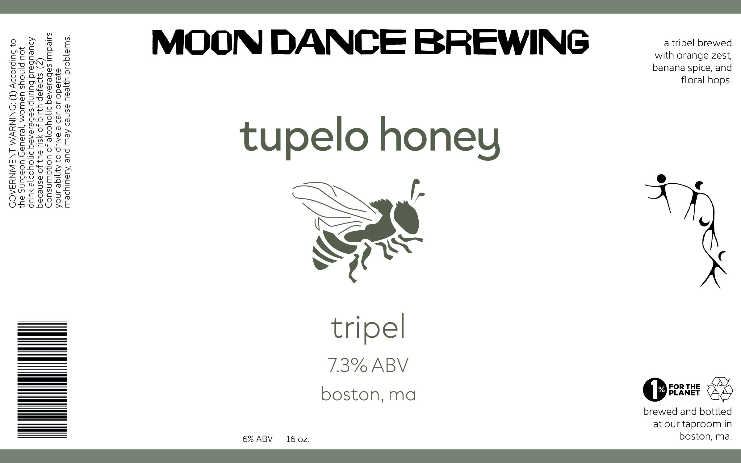
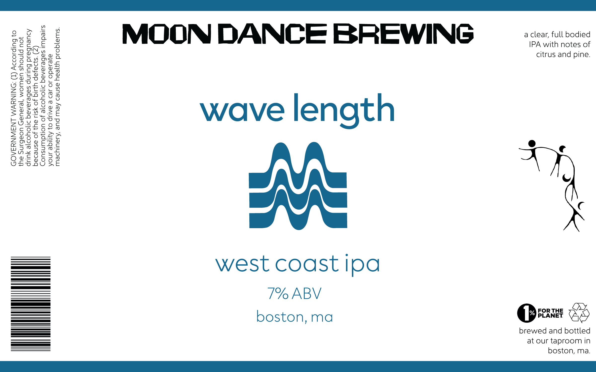
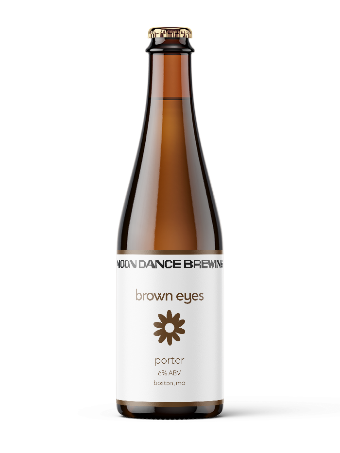
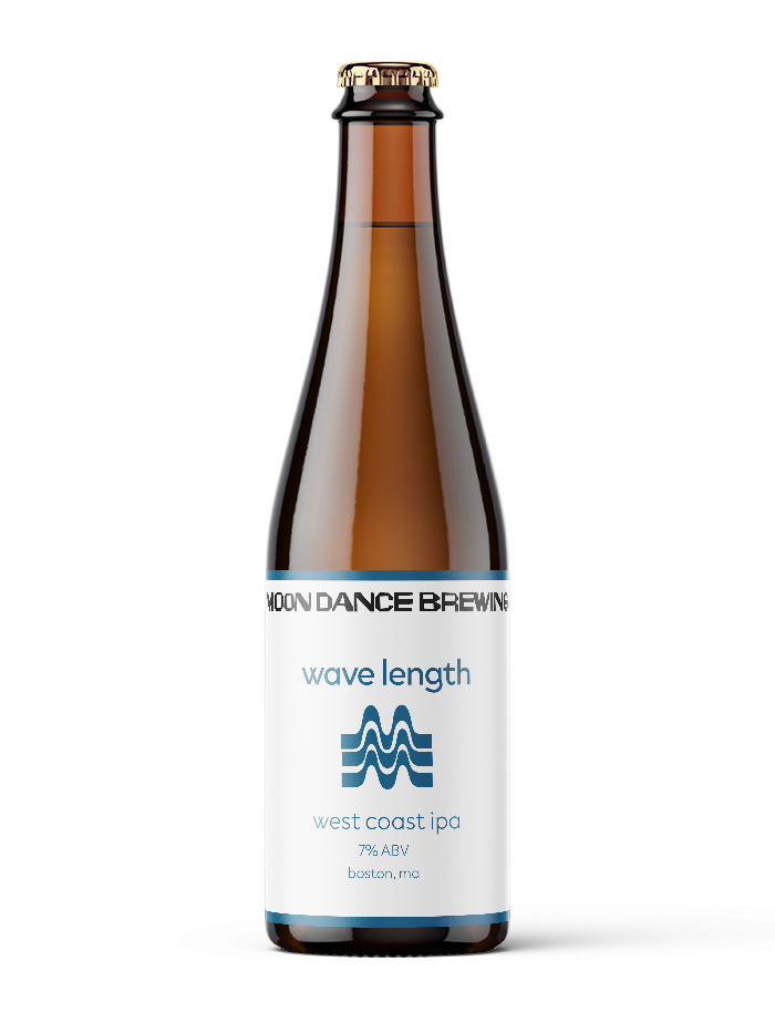
The Moon Dance Brewing brand identity was designed to feel welcoming, natural, and easygoing, reflecting the brewery’s laid-back atmosphere and community-oriented spirit. The visual system emphasizes warmth and accessibility, creating a brand that feels inviting and familiar while remaining distinctive on the shelf.
Simplicity played a key role in the development of the identity. The logotype is utilized as an anchor for the brand, allowing color and composition to drive the personality of each individual product. This approach keeps the identity feeling effortless and genuine, aligning with the handcrafted nature of the brewing process.
The beverage labels extend this concept through minimal layouts paired with vibrant, expressive color palettes. Each label is designed to be instantly recognizable while maintaining a cohesive system across the product line. By balancing restraint with energy, the labels feel playful and lively without becoming overwhelming, reinforcing Moon Dance Brewing’s relaxed and personable character.