Featured Work:
Turner Construction: Chicago Centennial
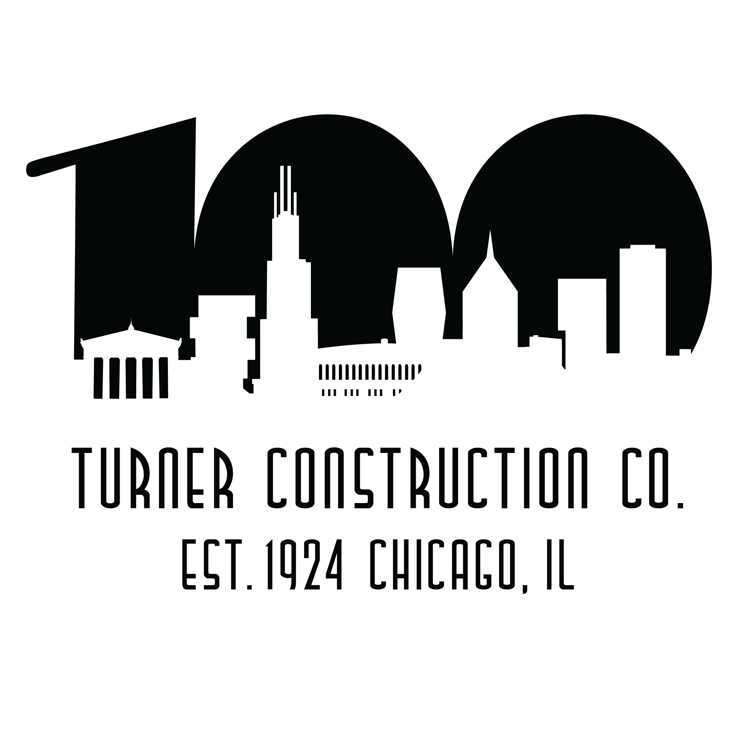
The Turner Chicago Centennial identity was inspired by the Art Deco movement, drawing from its architectural grandeur, bold geometry, and iconic typography. Art Deco’s emphasis on verticality and permanence directly parallels both Chicago’s skyline and Turner Construction’s century-long presence in the city.
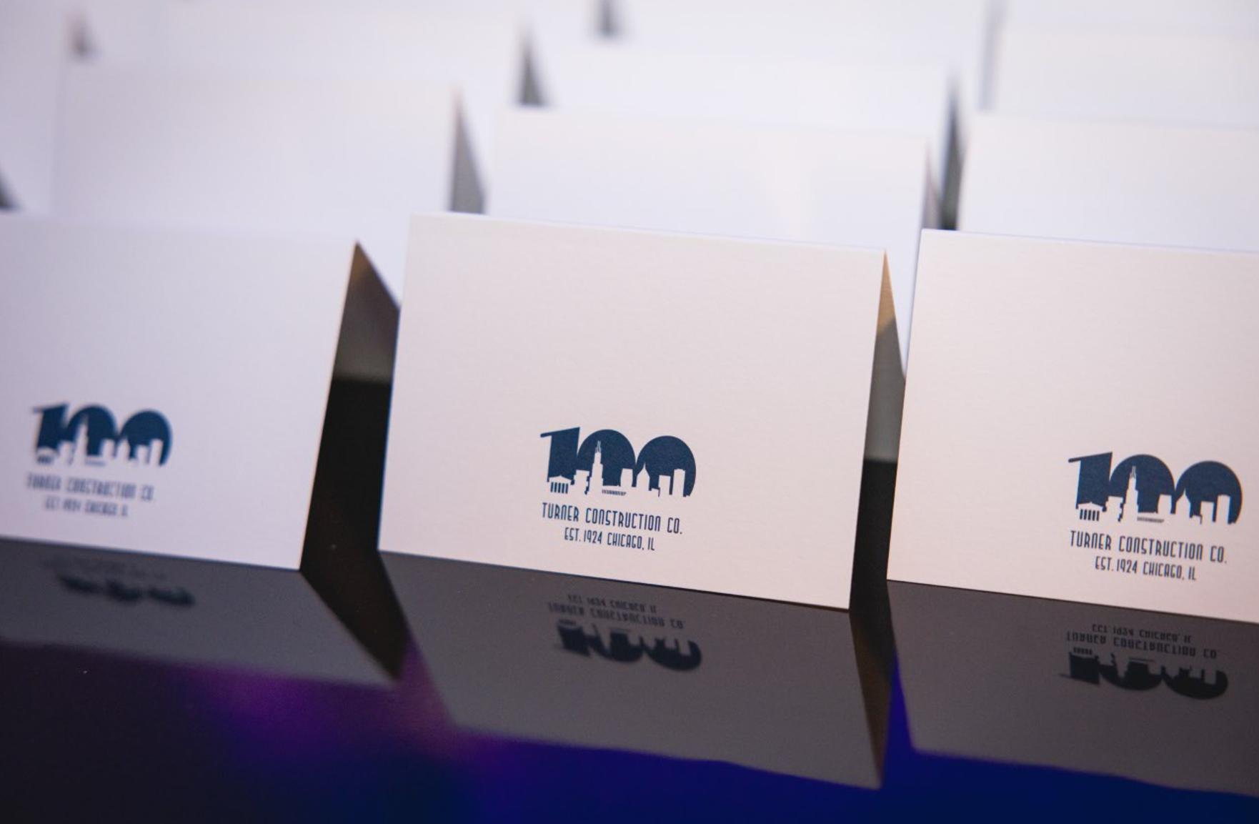
The concept centers on celebrating Turner’s accomplishments in Chicago over the last 100 years. The “100” mark functions as both a commemorative milestone and a structural framework, housing a skyline made up of iconic Turner projects. This approach allowed the logo to feel rooted in place while remaining timeless and forward-looking.
A primary goal of the design was to create a mark that is recognizable, scalable, and versatile. By reducing forms to strong silhouettes and emphasizing contrast, the logo maintains clarity across applications ranging from large-format graphics to small digital uses. The restrained palette and Art Deco inspired type reinforce a sense of heritage while ensuring the identity remains contemporary and adaptable.
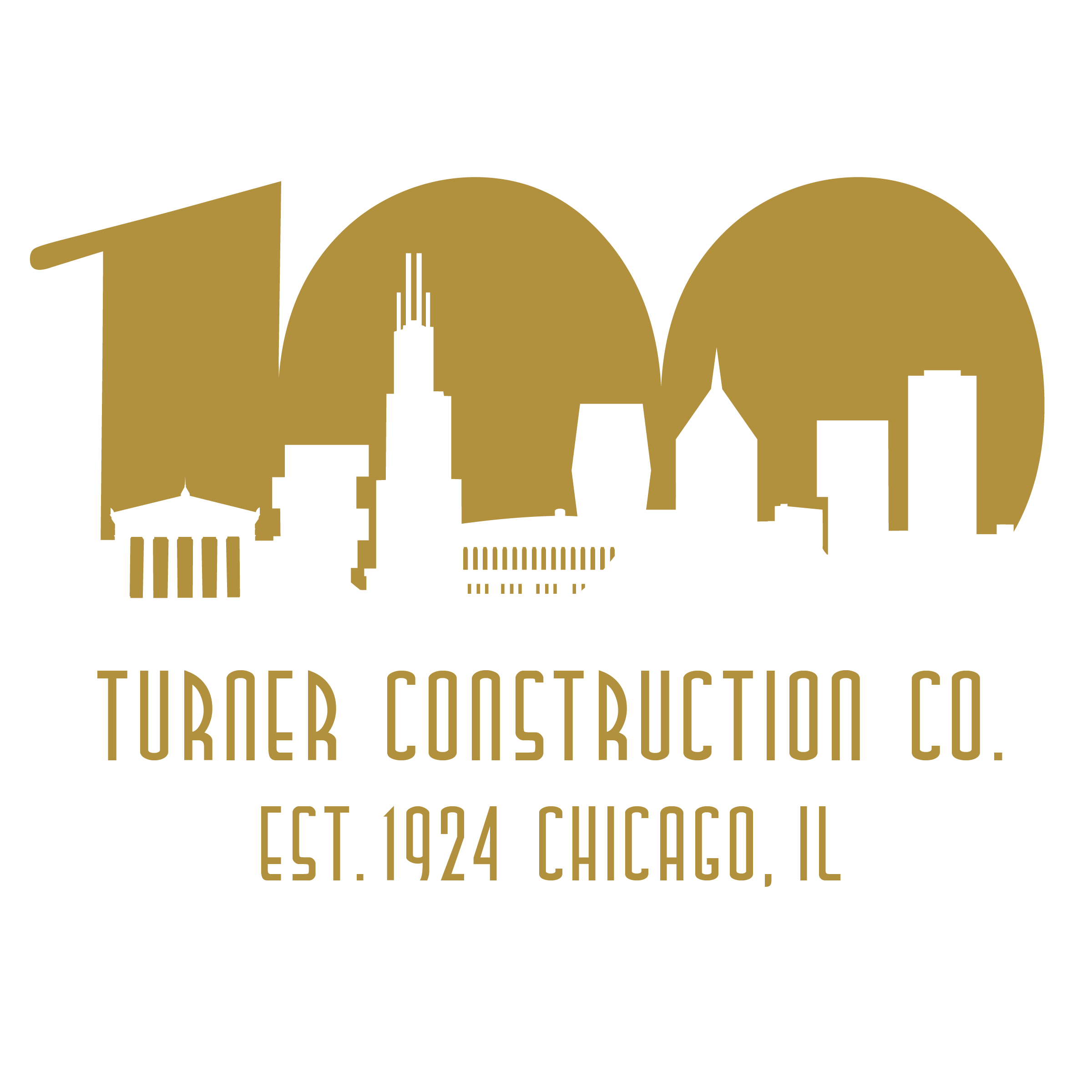
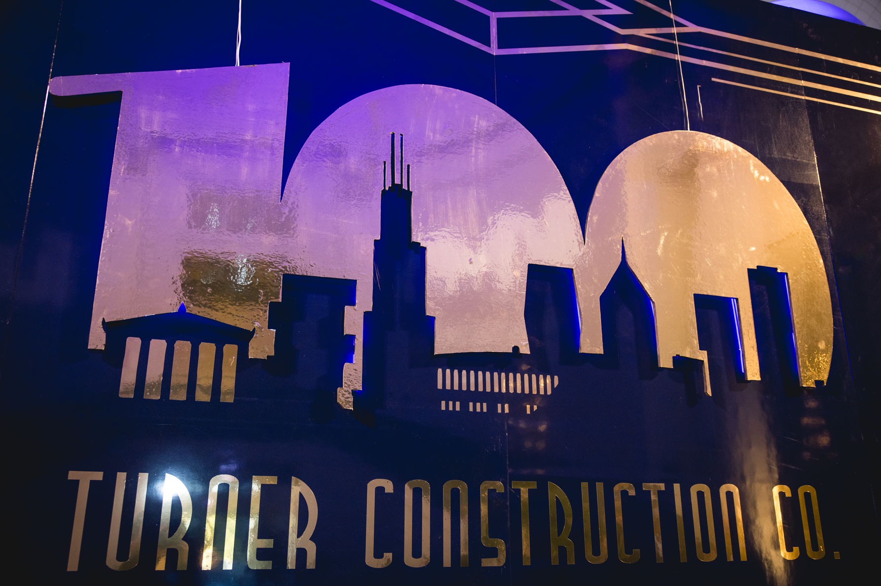
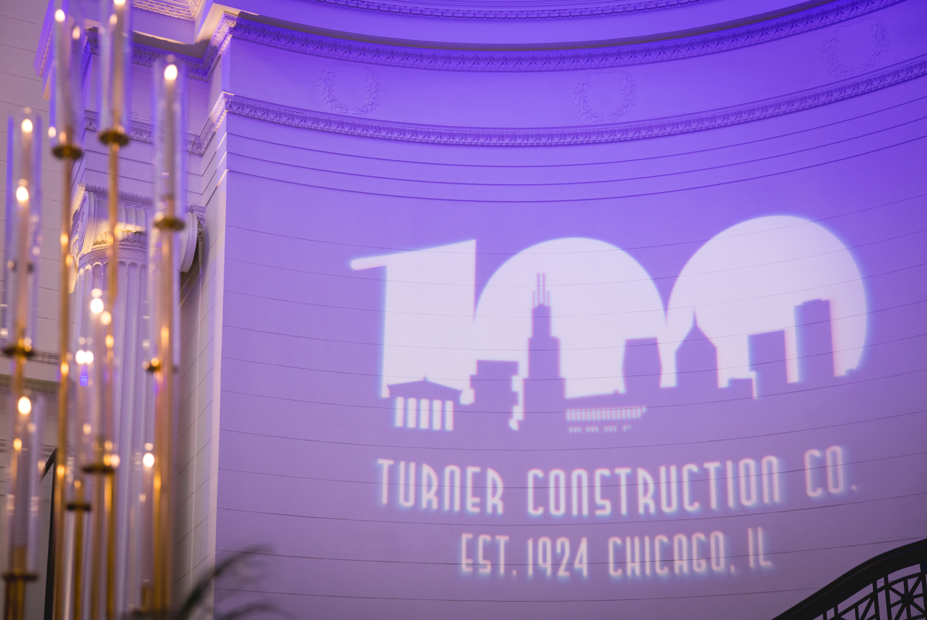
Pictured below are samples of how this brand identity was utilized, including physical signs, social media posts and banners.